

A Coffee Brand
Antonio
The Starting Point
Antonio came to us with an existing brand, or more precisely, a logo.
While functional, it lacked originality, distinctiveness, and a strategic
foundation. The visual identity felt generic and overused, with no real story
or emotional connection behind it.
Our Mission
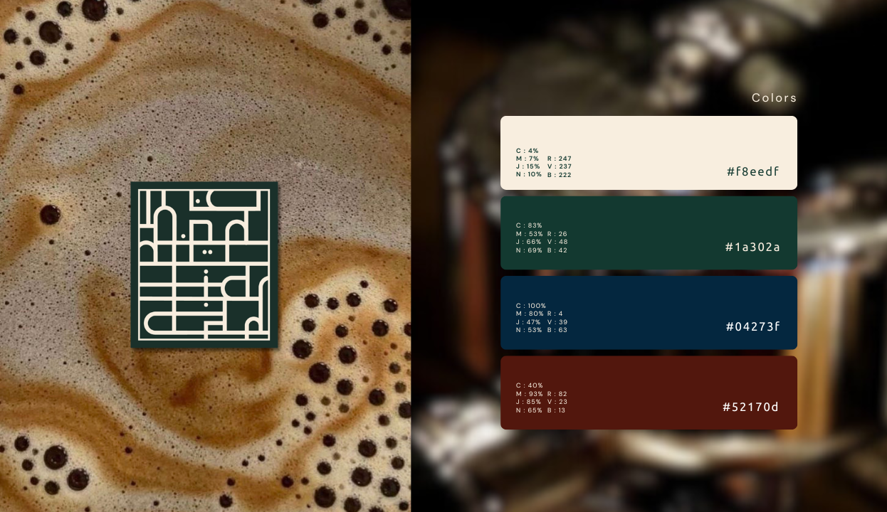
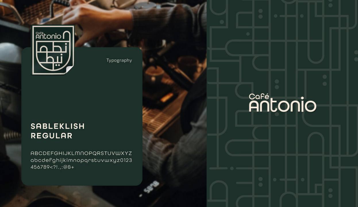
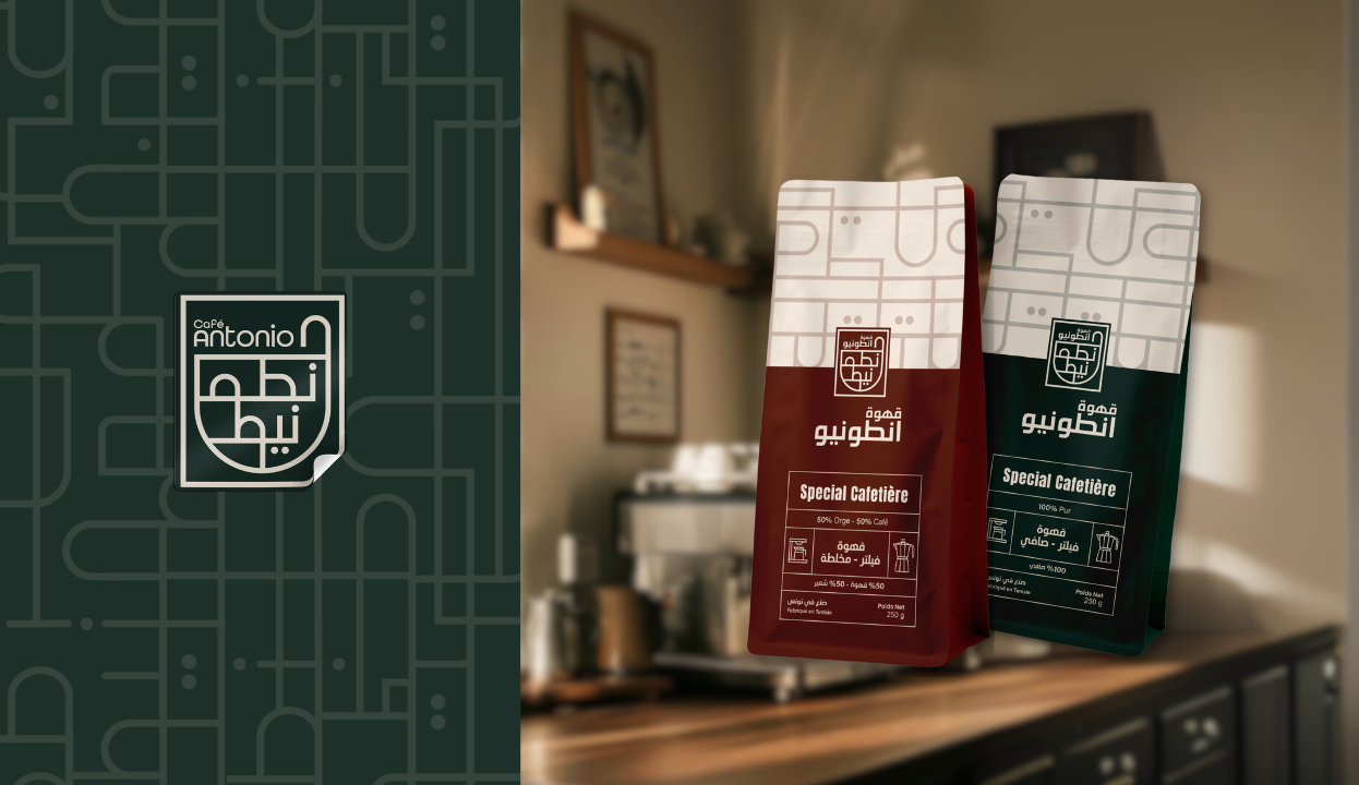
We were tasked with rebranding Antonio, giving it soul, meaning, and a
coherent visual universe. The goal was not just a new look, but a complete
repositioning that would stand out in the market and resonate with both
local and modern consumers.
Research & Brand Thinking
We began with a deep dive into the Tunisian coffee landscape, studying
consumer habits, competitors, and international references.
This process helped us:
- Identify what felt overdone and what was missing
- Explore how Antonio, an Italian name, could offer narrative potential
- Define a brand territory that blends Italian inspiration with Tunisian authenticity
This process helped us:
- Identify what felt overdone and what was missing
- Explore how Antonio, an Italian name, could offer narrative potential
- Define a brand territory that blends Italian inspiration with Tunisian authenticity
Applied Identity
The new branding was designed to perform across every surface:
- Façade: architectural presence that captures attention in a crowded
street
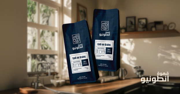
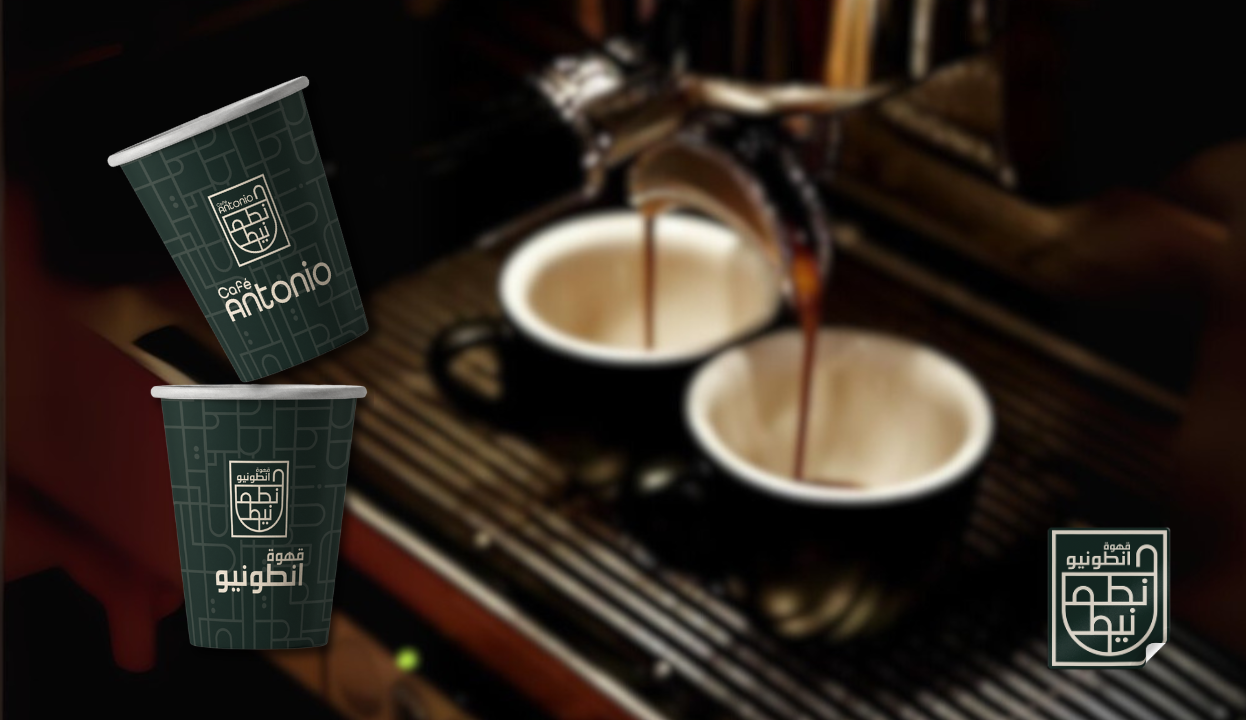
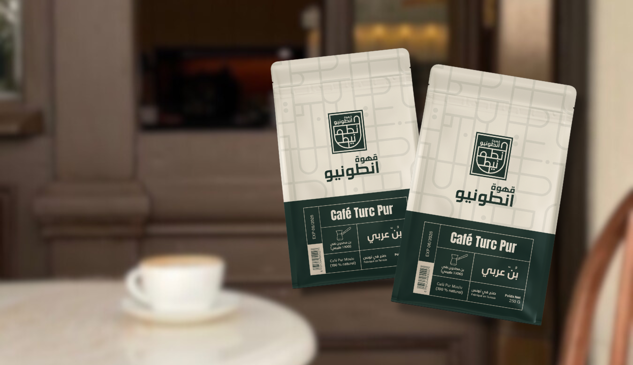
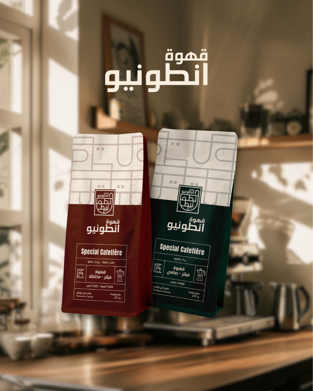
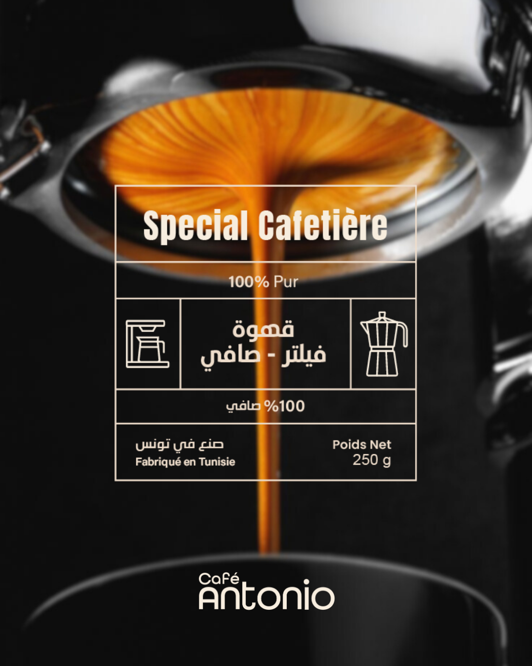
- Packaging: Instead of a one-size-fits-all approach, we built a packaging system tailored to each product category
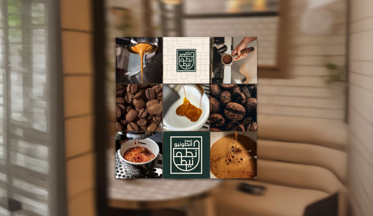
- Digital platforms: consistent storytelling and design coherence across social media, website, and content
- Packaging: Instead of a one-size-fits-all approach, we built a packaging system tailored to each product category
- Digital platforms: consistent storytelling and design coherence across social media, website, and content
