
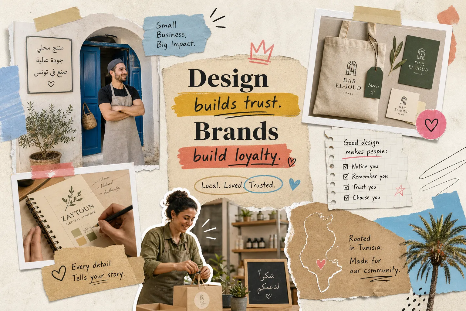
Graphic Design for Tunisian Small Business Brands
A potential customer in Tunis scrolls through their phone, passes your business’s post, and keeps moving. Not because the product or price is wrong, because the visuals looked unreliable. This happens dozens of times a day, and most business owners never see it happening. Visual communication is the silent decision-maker in every customer interaction, working before anyone reads a caption, clicks a link, or walks through a door. At Advery Agency, working with businesses across Sousse and the wider Tunisian market, this gap between a great product and a trusted brand image is one of the most consistent patterns the team encounters with new clients, based on the agency’s direct experience across dozens of SMB engagements. The product is often excellent. The graphic design infrastructure holding it together is not. This article breaks down the core visual design principles that build recognition, translates them into practical actions for Tunisian SMBs in food, fashion, and e-commerce, and closes with a commissioning checklist so you know exactly what to do next.Why your visuals make or break customer trust in seconds
Visual information registers before language does. Before a potential customer reads your business name, they have already formed an impression based on color, font, and layout. Industry research consistently finds that a brand’s graphic design is a key factor in purchasing decisions, some surveys place the figure as high as 85% of consumers. In a competitive local market, that first impression is often the only one you get. When a business uses one logo on Facebook, a different one on packaging, and a third on their storefront sign, it does not just look messy. It creates doubt. Customers associate visual inconsistency with operational inconsistency. Separate studies on brand consistency put the trust effect in the same direction: roughly 71% of consumers report trusting a brand more when it maintains a consistent visual identity across channels. Recognition converts to loyalty over time, and consistency, not novelty, is what drives that process. The real cost of inconsistent graphic design is not aesthetic. It is revenue. Many local Tunisian businesses invest heavily in product quality but treat visual communication as an afterthought, something handled with a free template or a quickly made logo. That framing misunderstands what design actually does: it is not decoration, it is the infrastructure of trust. Fixing it is not a creative expense; it is a revenue decision.The three design principles that directly affect recognition and conversions
Color: building a palette customers remember
Color is among the fastest brand recognition tools available. A limited, purposeful palette of two to three primary colors creates the visual shorthand customers use to identify you instantly. Color psychology, well-documented in general marketing research, suggests that warm tones communicate appetite and approachability, while cooler palettes tend to signal precision and professionalism. These associations broadly apply in the Tunisian consumer context, though local testing will always sharpen a palette decision. Contrast between text and background is non-negotiable, particularly on mobile screens where the majority of your audience is reading. A common mistake among local food businesses is using four or five mismatched colors across different platforms. In one client case from Sousse, a restaurant simplified its palette to two warm brand colors applied consistently across its Instagram grid, menu, and packaging. Social engagement picked up within the first month. Nothing on the menu was different, the brand finally looked as good as the food tasted.Typography: the font choice that signals your credibility
Font choice communicates industry and tone before a single word is read. A law firm and a children’s clothing brand signal completely different things through typography. The practical rule is to choose one display font for headlines and one clean body font for all other text, then use them across every touchpoint without exception. When fonts shift between your social posts and your printed materials, the brand feels assembled rather than designed, and that inconsistency registers, even when customers cannot name it. Sizing hierarchy matters just as much as font selection. Your headline, your caption, and your call to action should each read at a different weight and size so the eye knows where to go. One common mistake specific to bilingual Tunisian brands is using decorative Arabic calligraphy fonts at small sizes, where they become unreadable. Legibility always comes before style.Layout and visual hierarchy: directing the customer’s eye
Layout determines what customers notice first, second, and third. The most important information, usually your offer or call to action, should be the most visually prominent element on the page. White space is not wasted space; it gives important content room to stand out and makes a design feel intentional rather than crowded. A clean grid structure solves most layout problems before they start. Alignment, consistent margins, and clear grouping of related elements create order that customers read as professionalism. When everything on a poster or social post is competing for attention at the same visual weight, nothing wins.What good graphic design actually looks like in your sector
Food and hospitality: appetite-first visuals that earn return visits
Food businesses live and die on appetite appeal. A photographed dish needs proper lighting, a clean background, and intentional framing to convert a viewer into a customer. Dark, blurry, or over-filtered photos reduce perceived food quality before anyone has tasted anything. Menu layout legibility and consistent social media post formatting are equally important: overcrowded menus and inconsistent Instagram grids are among the most common graphic design mistakes seen in Tunisian food businesses. One Sousse restaurant the Advery Agency team worked with went through a rebrand covering a menu redesign, a unified Instagram color palette, and an updated logo. Foot traffic increased, online inquiries rose, and repeat customer behavior strengthened, results the client attributed directly to the visual overhaul. Customers who had eaten there for years started recommending it online. Nothing on the menu was different; the brand finally looked as reliable as the experience already was.Fashion and clothing brands: editorial consistency that builds a following
Fashion brands sell a lifestyle, not just garments. Consistent photography style, color grading, and font choice across product pages and social content are what build a following rather than just an audience. When every post looks like it belongs to the same world, the brand starts to feel aspirational. When posts look randomly assembled, even good products get overlooked. A Tunisian fashion client that standardized its product photography, consistent background, controlled lighting setup, and a fixed caption format across all platforms, recorded growth in both followers and online sales following the change. No new products were launched. What changed was a documented visual system that everyone working on the brand could follow.E-commerce: design choices that remove doubt at checkout
For e-commerce, graphic design is directly tied to conversion rate. Professional e-commerce redesigns commonly produce conversion improvements of 15 to 35% when they address product imagery, CTA button placement, trust signals, and mobile layout, not just the logo. Product images that include multiple angles, lifestyle context, and clean backgrounds reduce the doubt customers feel before committing to a purchase. Three immediate changes worth prioritizing: replace any low-resolution product images, make the add-to-cart button visually distinct from every other element on the page, and add consistent header branding across all pages so the store feels like a single coherent business. Poor layout at checkout is one of the most common causes of cart abandonment, and it is entirely fixable without a full redesign.Inside the design process: how Advery Agency moves from brief to final assets
The Advery Agency workflow begins with a structured discovery session before a single design decision is made. The team maps out the client’s target customer, competitive landscape, and communication goals, then builds a creative brief that covers audience profile, tone, sector references, and a complete deliverables list. Skipping this step is the reason most design projects fail or require expensive revision rounds later. Once initial concepts are presented, the revision process runs on specific, criteria-based feedback rather than subjective back-and-forth. This keeps timelines tight and outcomes clear. Final delivery for a typical Tunisian SMB client includes logo files in all required formats, a brand style guide covering color codes, font names, and usage rules, social media templates, and any print-ready assets needed for packaging or signage. The style guide is frequently the most undervalued part of the package, a consistent observation from agencies working with small businesses. It is what allows a business owner’s team to maintain visual consistency independently, without briefing the agency on every new post or printed material. A complete branding project in Tunisia typically costs between 1,500 and 3,200 TND depending on scope, with the investment paying back through improved brand recognition and customer trust over time.The commissioning checklist: what to prepare before your first agency meeting
Walking into a design agency meeting unprepared slows the whole process down and increases costs. The following checklist covers what every business owner should have ready before the first conversation:- Existing brand assets, even outdated ones (old logos, previous color choices, any past design work)
- Three to five competitor or reference brands you admire, and a specific note on what you find appealing about each
- A clear description of your target customer: who they are, where they are, and what matters to them
- A specific list of deliverables you need (logo, social templates, packaging, menu, website direction)
- The platforms where the design will appear, whether print, social media, web, or all three
- Your realistic timeline and budget range