When Jewelry Branding Looks Generic, Customers Assume the Craftsmanship Does Too
Most jewelry stores in Tunisia face the same problem: a logo that could belong to any brand, packaging that doesn’t match the value of what’s inside, and an identity that undersells the craftsmanship on the shelf. As a Tunisian branding agency based in Sousse, this is exactly the gap Advery closes. This case study covers how branding in Tunisia can be built to match real craftsmanship, using our work for Kamel Bouaouina Bijouterie as the example, including the direction we started with, and why the identity evolved into what it is today.
Kamel Bouaouina needed an identity that could stand next to the gold and gemstones on display; refined, timeless, and instantly recognizable across signage, packaging, and digital touchpoints.
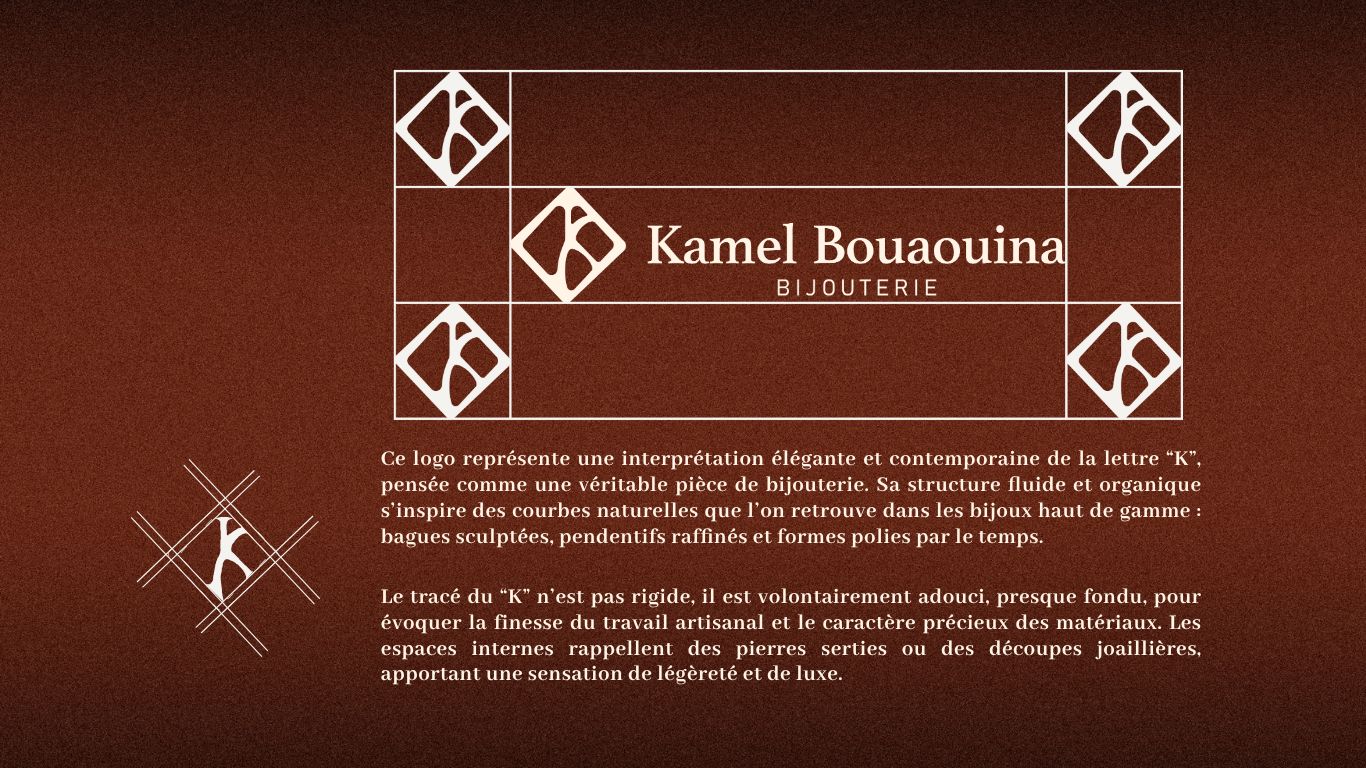
The mark reinterprets the letter “K” as a fluid, sculpted form, the same curves you’d find in a hand-carved ring or a pendant setting. The negative space inside the letter echoes a set stone. Nothing about the line work is rigid; every curve is softened, the way metal is softened under a jeweler’s hand.
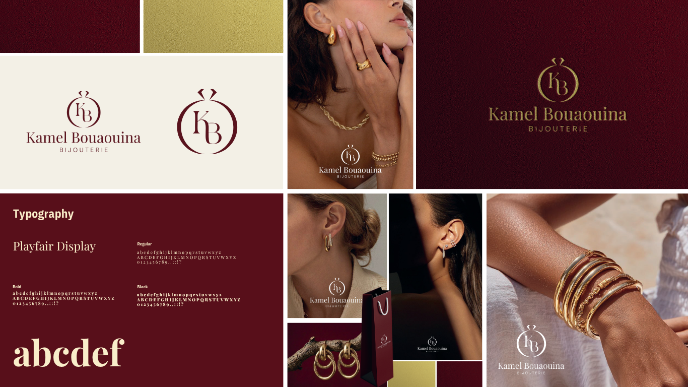
The palette; deep oxblood, aged bronze, and warm cream, was chosen to evoke leather jewelry boxes, antique metal, and candlelight on a showroom counter. It positions Kamel Bouaouina as heritage-driven rather than trend-driven, which matters in a category where trust and legacy sell.
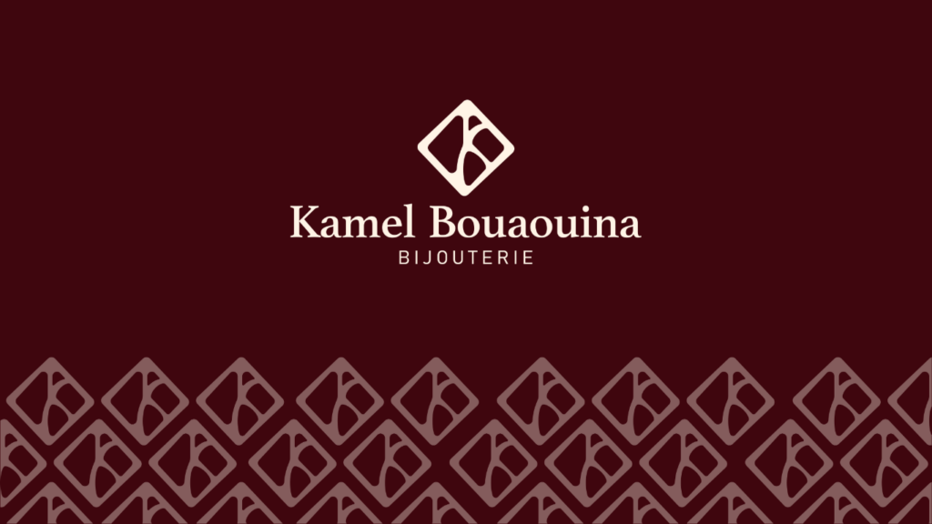
From the monogram, we built out a full system: pattern tiles (the diamond motif seen behind the wordmark), packaging, signage, and social templates, all extending the same jewelry-inspired language across every touchpoint.
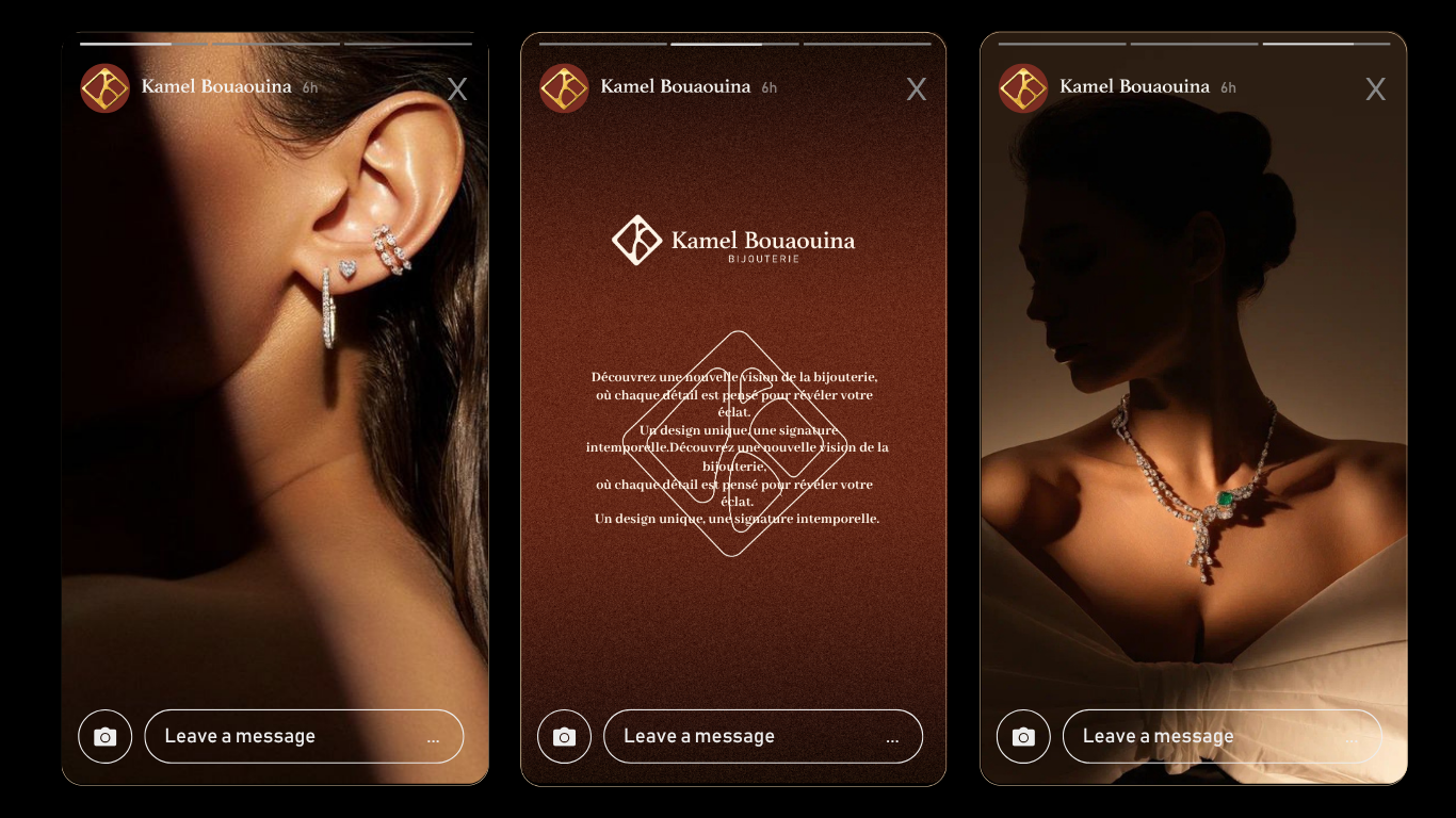
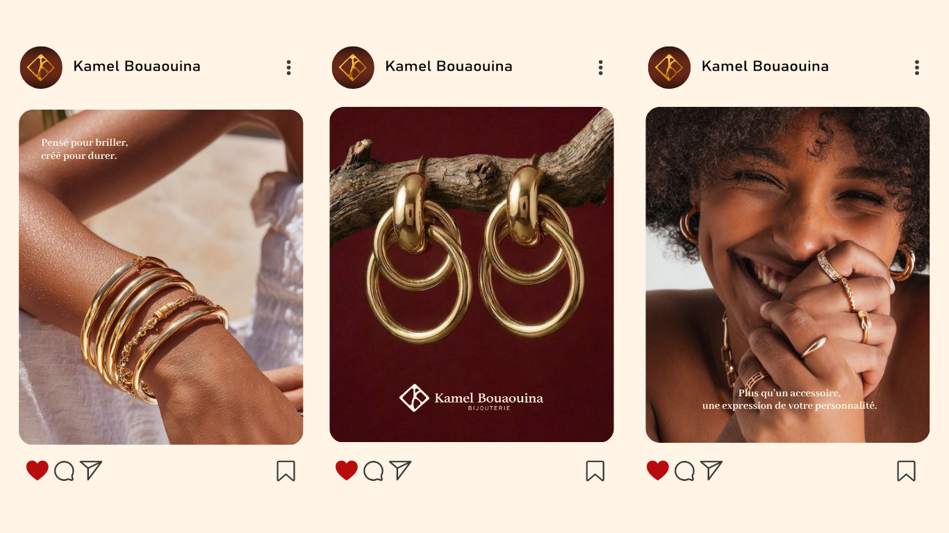
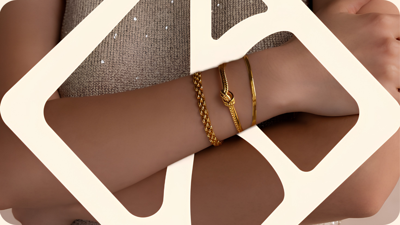
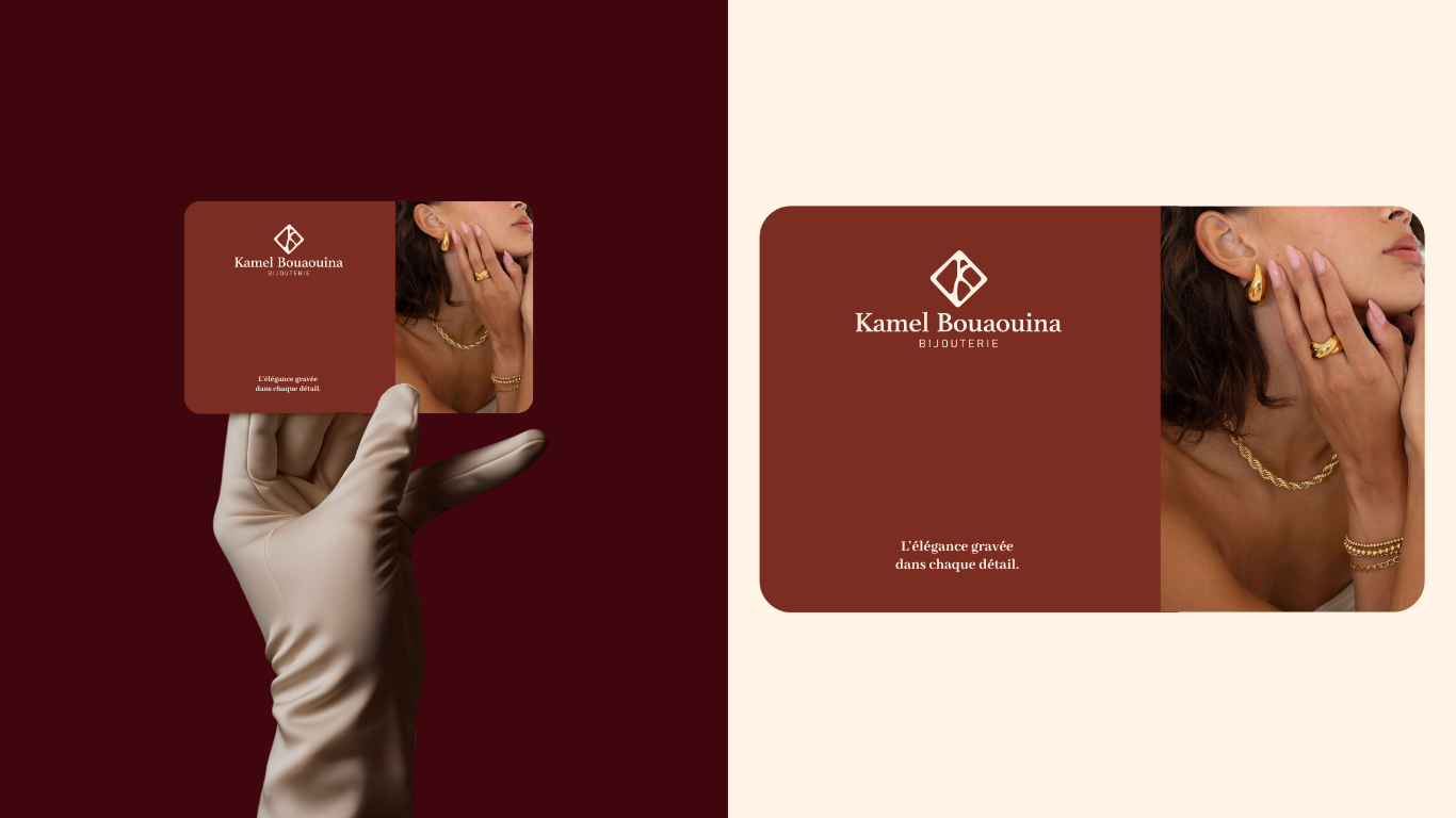
A jewelry brand that doesn’t need to say “luxury”, the identity says it for them. This is the kind of outcome we aim for on every branding project: a system precise enough for production, and expressive enough to be remembered..
Looking for a branding agency in Tunisia that treats every detail like it matters? Let’s talk about your brand.
FAQ
Advery is a Sousse-based branding agency offering full identity development, from logo and visual systems to packaging, signage, and brand guidelines for clients across Tunisia, the Gulf, and Europe.
A complete branding project, from discovery to final brand guidelines and collateral, typically takes several weeks depending on scope, with room for revision rounds at each stage.
A monogram gives a jewelry brand a mark that works as well engraved on a ring box as it does on a storefront sign; compact, elegant, and tied directly to the craftsmanship the brand sells.
Yes. Advery works with luxury and craftsmanship-driven brands, including jewelry, fashion, and artisanal goods, to build identities that reflect the precision and value of the product itself.